Can a Broken Urban Park Be Fixed? Portland’s O’Bryant Square: Part 2
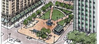
Why do we enjoy certain parks over others? Is the magic in the design or are there other factors to consider?
Welcome to Part 2 of our series on Portland’s O’Bryant Square, where we’re asking what it would take to improve this infamous urban park. In Part 1, we gave an overview of the park’s history and identified some of its key challenges. We also suggested that the interaction between a city park and its immediate surroundings dictates how useful, sustainable, and safe that park ultimately will be. This “interaction” includes both tangible and intangible elements, and we’re going to highlight ideas about the former – the physical elements – with this post.
The physical point of interaction for O’Bryant Square is the street edge on all four sides. To better understand street-edge interaction, we looked at some of the successful features of Portland’s recently completed Director Park, located three blocks south of O’Bryant Square. While it technically exists within the South Park Blocks, Director Park provides a fair comparison to O’Bryant Square because it’s also an “island park” with buildings on all four sides and is situated above an underground parking structure. Also interesting to note is that both parks are built on exactly the same-sized block, even though it’s easy to perceive O’Bryant Square as smaller.
Director Park has generally received an enthusiastic welcome to downtown, and street-edge design has likely played a role in that success. Let’s look at one particular street edge to see how it compares to O’Bryant Square:
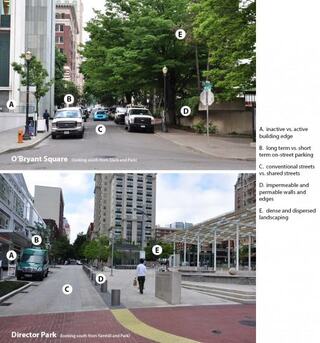
A. Active edges are an important component of successful open spaces. They facilitate pedestrian activity along the periphery of the space and provide “eyes on the park” to improve the feeling of safety. O’Bryant Square is missing active edges on three of its four sides, which significantly contributes to its feeling of separation and isolation. Director Park is surrounded on three of its four sides (the fourth is currently being constructed) with active commercial uses, including movie theaters and restaurants, which help activate the area throughout the day and late into the night.
B. On-street parking is important for retail, particularly in a vibrant commercial district. However, in this area of Downtown Portland, where off-street structured parking and mass transit is readily available, limited, short-term on-street parking (for loading and unloading) is more appropriate. This frees up more of the public right-of-way for other public amenities, like stormwater planters and more open space area.
C. Reallocating public right-of-way from auto storage (on-street parking) to active pedestrian zones – as seen in Director Park – creates larger open spaces and provides traffic calming for pedestrian safety. The streets around O’Bryant Square are discretely compartmentalized: the roadway is for moving and storing vehicles and pedestrians are expected to navigate on the edge on sidewalks and cross at designated points. The streets on the east and west sides of Director Park are intended to blur the distinction between “vehicle zone” and “pedestrian zone”, even allowing park uses to spill into the travel way…
D. …which opens up the edge of the park, allowing people to freely flow into and out of the space. O’Bryant Square has many impenetrable walls and edges, which restrict movement into and through the park. These edges create internal spaces with no outlet which can encourage inappropriate / illegal park activities (such as drug activity and camping) and contribute to the sense that the space isn’t safe. People cannot see into the park and are less likely to enter the space, much less stay and hang out. Director Park has made an effort to be open and accessible on all sides and from all intersections. As a pedestrian approaches the park, they can see into and through the space, which conveys a sense of safety and welcoming.
E. And while landscaping is an unequivocal park amenity – especially mature deciduous trees that provide shade in the summer – the 40-year old trees that surround O’Bryant Square seem to overwhelm the space. The dense canopies create shady corners and nodes on the high edges of the space that can be dark and uninviting. The landscaping at Director Park has been used in deliberate applications and, when mature, will not obscure the area.
In an effort to revitalize O’Bryant Square, the City has explored various redesign proposals over the past decade. SERA was involved in some of those explorations, most notably in 2001 when we proposed a wide range of scenarios to consider. One piece of that redevelopment proposal posed three different cost-based scenarios for O’Bryant Square; each one addressed key aspects of improving street-edge interaction. As you will see, all of the following scenarios contemplate a complete redevelopment of the block to the north with a mixed-use building that would activate that street edge.
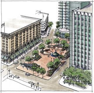
The first of the three concepts offers the most-cost effective approach, which maintains much of the existing hardscape while offering some key changes to improve the park’s interaction. While it is a bit difficult to see in this rendering, staircases have been added to both northern corners to provide pedestrian entry points at the street-level that currently do not exist. Additionally, the existing bus shelter on the south edge is rebuilt with a more inviting, pedestrian-oriented design.
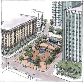
The second concept reconfigures the park’s flow by creating an interactive water feature at the center of the square and a gathering deck at the higher, northern patio. It should be noted that the current parking garage beneath the square requires the entry and exit point to be located at the northern edge of the park. This concept keeps the current parking garage access because re-locating the garage entry/exit would require significant reconstruction of the garage.
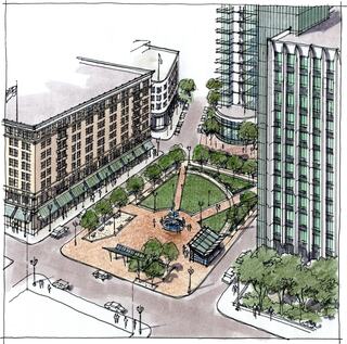
Casting off regard for the garage entry, the third concept strives to optimize all four edges of the park’s interaction by lowering everything to the street elevation. To do so, the parking garage would need to be reconstructed/expanded to have the entry and exit occur farther to the north and in connection with the new mixed-use structure. Given full creative reign with the park block, this design maintains a central water feature while adding grass areas and more formal seating along walkways. A pedestrian stairwell down to the parking garage is added, which could also be multi-purpose such as the restaurant structure at Director Park.
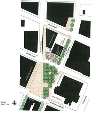
Ben Nielsen Redesign Concept
This notorious design challenge has even made its way in front of local college and graduate students over the years. Our very own Ben Nielsen was given a design studio task centered on O’Bryant Square during his Masters program in the University of Oregon’s School of Architecture. Ben’s resulting concept explored ways to leverage plantings and a reconfiguration of the below-grade parking garage access to foster the connection of O’Bryant Square to northern pedestrian destinations such as Ankeny Square and the North Park Blocks. Additionally, Ben highlights the opportunity for strategically placed retail and residential developments to activate the street edges and enliven pedestrian activity.
When it comes to repairing O’Bryant Square, all of the above ideas rely on physical improvements to make the transition. This begs a bigger question: Are physical alterations truly the way to inject life into this park? If any of the above concepts are built, would the use and utilization of the park change? Is capital necessary for creating a beloved and well-used public space?
What do you think? Which of these designs – if any – resonate with you? Alternatively, what are some design concepts that could be explored further?
In our final piece in this series, we will shift our focus to the softer side of the equation: What role does programming (and maybe a little luck) play in creating a successful park?
